Space Planning 101: Layout Templates and Measurements Built Into Ready-Made Packages

Space planning isn’t just moving boxes on a floor plan—it’s the craft of turning square meters (or feet) into rooms that feel effortless to use. Whether you’re fitting out a studio apartment, a small clinic, or a co-working nook, the fastest way to get from “blank canvas” to “works beautifully” is to start with layout templates that already bake in real-world measurements. Done well, these templates accelerate decision-making, prevent costly errors, and give every stakeholder a shared language for what “good” looks like.
What are layout templates, exactly? Think of them as pre-composed plan sketches—kitchen runs, bedroom suites, meeting rooms, reception zones—each built on a modular grid with standard clearances included. Instead of reinventing a bathroom every time, you drop in a template designed around door swings, fixture sizes, and circulation space.
Many ready-made packages bundle dozens of these templates, plus dimensioned furniture blocks, material palettes, and printable checklists. For a clear, measurement-aware example of such kits, review options like those presented at https://packages.fullflat.com/ to see how templated arrangements can speed up early planning while staying dimensionally honest.
Contents
- 1 Why measurements built into templates matter
- 2 What’s inside a ready-made package
- 3 How to work with templates without getting “cookie-cutter”
- 4 A quick measurement primer you’ll actually use
- 5 Residential vs. workplace: different rhythms, same math
- 6 A six-step workflow for faster, safer space planning
- 7 Common pitfalls templates help you avoid
- 8 The bottom line
Why measurements built into templates matter
Even seasoned designers underestimate clearances when they’re sketching fast. Templates “bake in” the boring but vital numbers so you can focus on storytelling, branding, and light. They also make collaboration smoother: clients grasp a template in seconds because the pieces are familiar—“that’s a queen bed with two nightstands; the closet doors clear the bedside”—and the dimensions are already vetted.
Here are practical rules of thumb commonly embedded in good ready-made layouts (always verify against your local codes and project constraints):
- Primary circulation: Aim for 36 in / 914 mm clear. In tighter residential passages you might dip slightly, but 36 in keeps flow comfortable.
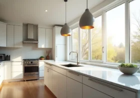
- Kitchen work aisles: 42 in / 1067 mm for one cook, 48 in / 1219 mm for two. Island clearances of 36–42 in / 914–1067 mm prevent bottlenecks.
- Dining comfort: Allow 24 in / 610 mm per seated person along a table edge, with 36 in / 914 mm behind chairs for pass-through.
- Bed access: Target 24–30 in / 610–762 mm on at least one side of a bed; both sides for shared beds.
- Door swings: Plan the arc plus 2–4 in / 50–100 mm of breathing room so hardware doesn’t collide with furniture.
- Bathroom basics: Around 30 in / 762 mm clear in front of a sink or toilet feels workable; showers function well from 36 x 36 in / 914 x 914 mm upward.
When these dimensions live inside a template, you don’t have to re-calculate clearances every time you nudge a wall. You’re designing with safe defaults.
What’s inside a ready-made package
A strong space-planning package typically includes:
- Room archetypes: Pre-sized kitchens (galley, L, U, island), bedroom variants (single, double, suite), bath typologies (powder, full, accessible-friendly), lounge pods, huddle rooms, team spaces, and reception desks.
- Furniture and fixture blocks: Dimensionally accurate, annotated, and set on a consistent layer system so they snap cleanly to grids.
- Grids and modules: Base increments—often 100 mm / 4 in or 300 mm / 12 in—that govern wall moves and furniture spacing.
- Measurement overlays: Transparent guides for circulation rings, door arcs, and sightlines that you can toggle on/off to sanity-check flow.
- Scenario templates: “Starter plans” for common footprints: a 30 m² studio, a 60 m² one-bed, a 12-seat meeting suite, a 6-desk open bay, etc.
- Documentation cheatsheets: Print-friendly pages with the clearances you’ll reach for daily, plus quick conversion tables (imperial↔metric).
Templates aren’t cages; they’re launchpads. Use them as structured suggestions, then tune them to context:
- Start with adjacency, not aesthetics. Decide what must sit next to what—kitchen near entry, meeting pods near windows, noisy vs. quiet zones—then select the template that best expresses those adjacencies.
- Snap to the grid, then bend it. Lay down the template as-is to secure clearances, and only then make controlled deviations: widen a corridor to capture a view, rotate the dining table to face the terrace, or mirror the bathroom to stack plumbing.
- Iterate in tiers. Version A uses the smallest recommended clearances (tight but efficient). Version B adds +2–4 in / 50–100 mm where it counts (luxury elbowroom). Present both—clients love choice grounded in numbers.
- Use measurement overlays as a safety net. Turn overlays on after each round of edits to catch new collisions (that coat closet door now swings into the sofa—oops).
- Localize the template. Swap furniture sizes to match regional standards and suppliers; keep the circulation rings unchanged so flow quality survives the substitution.
A quick measurement primer you’ll actually use
When you’re customizing, these few conversions and checkpoints will save you hours:
- The 3-4-5 rule for right angles: On site or in a sketch, a 3-4-5 triangle still proves 90°. Scaled up (300–400–500 cm) it’s construction-friendly.
- Golden range for “reach”: Most counters and worktops feel right between 34–36 in / 864–914 mm high; bar counters often at 41–43 in / 1040–1090 mm.
- Seating depth reality check: Lounge seating needs 20–22 in / 510–560 mm of seat depth; add 12–18 in / 300–460 mm of knee space to coffee tables.
- Sightline test: From a seated eye height of ~44–48 in / 1120–1220 mm above floor (standing), ensure key views aren’t blocked by partitions taller than 42–48 in / 1067–1219 mm in open offices—unless privacy is the goal.
Residential vs. workplace: different rhythms, same math
- Residential templates foreground comfort sequences: entry → drop zone → kitchen triangle → dining pivot → sofa sightline to daylight. Measurements protect daily rituals (coffee, laundry, bedtime).
- Workplace templates prioritize density and acoustics: desk bay spans, buffer distances to focus rooms, and sightlines to daylight cores. Circulation rings are wider in zones with high foot traffic; small rooms get over-sized door swings to prevent “meeting ballet.”
Yet both environments benefit equally from dimensioned templates. They codify the quiet math—how far the chair slides, how deep the drawer opens—so your design energy goes to proportion, character, and light.
A six-step workflow for faster, safer space planning
- Define constraints first. Structural grid, MEP risers, window mullions, egress paths, code limits.
- Pick the closest template. Choose by room count or seat count, not by style.
- Drop in measurement overlays. Confirm clearances before you fall in love with a layout.
- Tune adjacencies. Rotate/mirror modules to align doors, windows, and views.
- Prototype two scales. A “lean” version at minimum clearances, and a “generous” one at +50–100 mm.
- Lock and document. Export the dimensioned plan and the corresponding checklist so downstream teams (estimating, joinery, MEP) can act without guesswork.
Common pitfalls templates help you avoid
- Hidden collisions: Door handles clipping casework, oven doors blocking walk paths, fridge doors hitting islands.
- Under-sized storage: Closets too shallow for standard hangers (24 in / 610 mm clear is the sweet spot).
- Wasted “leftover” slivers: Odd gaps that don’t fit a standard module become dust traps; templates nudge you back to the grid.
- Chair creep: Meeting rooms shrink on paper; chairs still need space to push back. Templates include that push-back ring.
The bottom line
Space planning is equal parts empathy and arithmetic. Ready-made packages give you the arithmetic in a box—templates pre-tuned to real measurements—so you can pour your energy into empathy: the way a morning flows in a kitchen, how a team gathers around a problem, where the eye rests at the end of a long day.
Start with a grounded template, respect the numbers, and then make it sing for the people who’ll live or work there. That’s Space Planning 101—and it scales from micro-studio to full office floor with less stress, fewer revisions, and far better results.