Designed to catch your eye: The psychology of apps
Ever wondered why it’s always just so tempting to pick up your phone and scroll? There’s a reason why mobile devices are so enticing, and it all revolves around human psychology. For many years now, the world’s most successful tech companies and app developers have consulted leading psychologists and behavioural experts to understand what makes their users tick, allowing them to design their apps in the most eye-catching, engaging way possible.
We live in a fast-paced world in which countless digital platforms are competing for our attention, and they all use a variety of fascinating methods to keep us coming back for more. In today’s article, we’ve explored some of the most interesting psychological features of app design today – the results are seriously eye-opening!
Bright lights: the eye-catching impact of colors
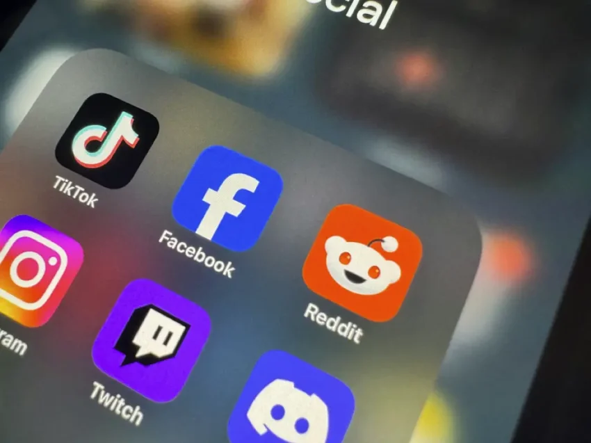
One of the most crucial elements of the psychology of apps is their use of color to capture the senses. Our brains are hard-wired to respond to bright colors, and around 80% of our sensory impressions come from our visual system, meaning that the graphic design of modern apps places a strong emphasis on the use of bright, eye-catching hues.
To understand the true effect of these vivid colors, try putting your phone into greyscale mode, and you’ll immediately understand just how important these luminous visuals really are. The implementation of vibrant, shiny colors across our devices is what attracts us to them in the first place, in the same way that bees are drawn to specific, brightly colored flowers – without them, our phone screens would just appear boring and lifeless.
Just as we are drawn to the beauty of a sunset or the blue sky of a summer’s day, colors are absolutely crucial to our appreciation of the digital world, and they play a major part in drawing us towards a specific product or service.
The high impact of color usage is the reason why most app notifications use shades of red, as the human brain associates this visual signal with urgency and significance, and the sight of red sometimes even primes us to expect imminent danger.
The use of the color red is therefore hugely important within modern app design, as it is proven to be one of the most effective ways of capturing our attention and encouraging users to click through for more information.
On the other hand, if you take a look through your home screen, you’ll notice that most of the mobile banking and finance-related apps feature cool tones of blue and green, since we tend to positively associate these colors with stability, control, and serenity.
These subliminal visual cues have a massive cognitive influence, meaning that no digital color palette is randomly selected – instead, there is a clear psychological decision behind every visual design choice within the apps of today, which helps to subconsciously shape our initial opinion of every digital product we interact with.
Endless engagement: the psychology of the user experience
Alongside their eye-catching appearance, a significant amount of psychological research also goes into the design of the overall user experience (UX) of every single app available today. App developers typically aim to make the interface as smooth and frictionless as possible, as any frustrating glitches or lags will be off-putting amongst modern mobile users, who have come to expect and demand a highly streamlined experience.
Psychological tricks are used to make the UX as enjoyable as possible – whether that’s through one-click payment methods or built-in reward systems, the goal is to offer the simplest and most satisfying mobile platform.
This demand for simplicity and satisfaction is particularly evident in the competitive world of iGaming, in which many of the apps rated by Casino.org offer easy payment methods, slick graphics, and immersive UX features.
With leading developers competing to offer the smoothest and most enjoyable user experience, this race to the top has massively boosted the popularity of mobile gaming around the world today.
Whilst the overall look and feel of an app is hugely important, developers now also place a keen emphasis on the use of personalization techniques to tailor the experience to each individual user. Modern apps have been designed to both capture and maintain our interest, meaning that endless work has gone into keeping everything running smoothly and making each platform as customizable and personalized as possible.
A prime example of this is the hugely popular social media platform TikTok, which has employed sophisticated machine learning algorithms to offer a unique experience for each individual user. It’s famous ‘For You’ page analyses user behavior to make specific, personalized video recommendations, and the results are often scarily accurate.
And when this highly personalized playlist is combined with the ‘infinite scroll’ feature, TikTok has an incredible ability to keep its users engaged for significant amounts of time – the app is now estimated to have around 1.5 billion monthly users worldwide, making it one of the most successful social media platforms in history. This can largely be attributed to its winning formula of psychology-led design, in which personalization is the key to keeping people engaged.
Ultimately, it is clear that the psychology of apps runs deep and has become a key component of pretty much every design feature today. In our fast-paced digital world, app developers are constantly competing to grab our attention by coming up with new ways of keeping their users engaged.
By employing the principles of human psychology, the people who design the most popular mobile platforms have figured out all the best ways to keep their users coming back for more – one more click, one last scroll, one more purchase.
Next time you pick up your phone, take a moment to really consider how each individual app makes you feel – whether that’s through its chosen color scheme, the overall user experience, or any built-in special features. Having a critical understanding of these psychological methods can be seriously fascinating, and you’ll begin to realize how every single element of mobile apps is designed to catch your eye.